The data that is created each year continues to grow by leaps and bounds. By 2020, the global annual rate of data production is expected to reach 8.6 zettabytes, double the rate of growth in 2012, according to IDC. This data doesn’t provide executives and other decision makers with valuable insights on its own. But the good news is there might be an easy solution: using our eyes more. So visualizing information is how we can see the patterns and connections that matter, and in designing information so it makes more sense or it tells a story or allows us to focus only on the information that’s important. It offers a new approach to dramatically improve the ability to grasp valuable information hidden in the data.
As the great Apple designer, Johnny Ive, said “we spend most of our time getting design out of the way”. It’s got to get out of the way, because it’s about the relationship with the viewer, and how they reason about the content. Style and aesthetics can’t rescue failed content. If the words aren’t truthful, the finest optically letter-spaced typography won’t turn lies into truths.
The big steps in showing information began with cartography about 6000 years ago, when the first map was scratched into a piece of stone. And that has wound up now with the most widely seen visualization in the world, which is Google Maps, where people are using a visualization to actually see something or searching for an information. The next step was the development of real science. Galileo saw with his telescope new things that he visualized by drawing them. The history of visualizing data is very substantially a history of science.
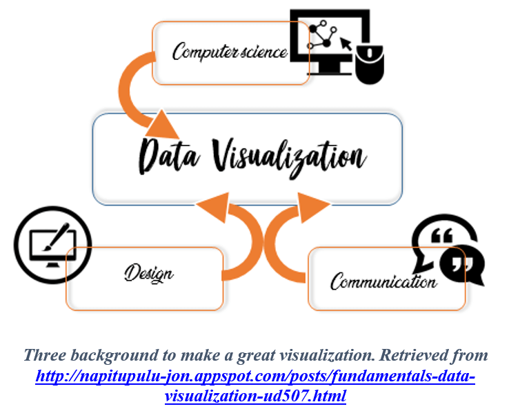
Data visualisation is not some airy creative process, but it’s actually a very linear process of decision making that we can do based on some few basic principles. There are three things a design should inform: one as a designer and what he want to communicate, two is the reader that will come with his own context and biases, and the designer need to account for that. The third thing is the data itself, and what it has to say and how that informs the truth.
There’s a lot of subconscious brain activity happening and we evolved for it to happen that way, to see things and make snap decisions. That can be an advantage as a designer, who can communicate with information in a quick way, because we all have brains that are designed to recognize patterns this way. But there is also the emotional impact, so if we want to change someone’s mind or behavior, we can present the information in a visual format because this is the fastest way to get them to engage with that information.
As Josh Smith said “Data is just a clue to the end truth.” Truth is one of those ambiguous things that you can’t define, and probably changes and evolves, the more understanding you have.
Data itself is a result of research. In fact a successful infographic tells a story, it communicates accurate and sometimes complicated data in a way that many people can understand. The first step usually is always to dig deeply into the data ourselves, and find each key point, and create a hierarchy and a narrative out of that story. Then we start to merge different pieces of information and to learn really what it is all saying; the narrative is clear.
When we look at a piece, it’s successful when it translates data from something that’s complicated to something simple. A communication of a message that otherwise would have taken somebody hours to digest.
The software artist, Jerr Thorp said “My deepest interest lies between data and culture”. Data are measurements of something. In very many cases, it is about human systems, we’re dealing with data systems that are larger than anything that humans have ever built or experienced before.
Data visualization is about designing and developing ways to make information accessible through visual representations. And to understand data and their true potential we have to forget about them and see through them instead. Because data are just a tool to represent reality, they’re used as a placeholder for something else.
The Importance of Visualizations in business
Edward Tufte, a data visualization expert, says ‘Graphical excellence is that which gives to the viewer the greatest number of ideas in the shortest time with the least ink in the smallest space.’
Visuals that are meant to direct the viewer along a defined path are explanatory in nature. The bulk of business dashboards that we come across in day-to-day scenarios fall in this category.
Exploratory visuals offer many dimensions to a data set. They invite the viewer to explore the visual, ask questions along the way, and find answers to those questions.
Because a picture is worth a thousand words when we need to understand and discover insights from data. Visuals help to find relationships among hundreds of variables to determine their relative importance.
Exploratory is about to know what is the data, how we defined it. Use the visualization to find the gem from all the rock. Have some unbiased presentation so readers would understand. After you get the analysis, you share your insights in the Explanatory.
Data visualization today:
Today, our lives are filled up with a enormous amount of data that overloads us. This trend seems to be going nowhere since the data is only growing in size over time. Visual representation of data is increasingly part of the public disclosure. Data visualization is necessary to bring the power of this data, because decision making primarily relies on data, that can be used at such an overwhelming velocity and in high volumes we can’t comprehend unless we implement some layers of abstraction.
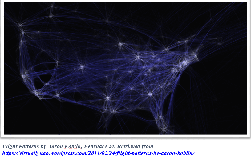
Aaron Koblin think that our lives are being driven by data. The act of collecting and creating all kinds of date about how we’re living, is telling some amazing stories. He’s been working on project that reflect on our lives and the system we are living on. The project is called Flight Patters. The picture bellow is showing an airplane traffic over North America for a 24-hour period. The picture is a capture from a video, planes are moving from the East coast to the West coast. There is about 140,000 planes being monitoring by the federal government at one time. This visualization is on Google Maps and allow us to zoom in and see individual airports and the patterns that are occurring there. The white represents low altitudes and the blue high altitudes. We can also toggle between altitudes for model and manufacturer. The zoom back out is really quick.
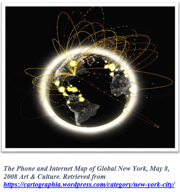
There is another project he worked on with the Sensible Cities Lab at MIT. It’s about visualizing international communications. It’s about how New York communicates with other cities.
They set this up as a live globe in the Museum of Modern Art in New York. The picture show us the changing relationship and some kind of demographic information.
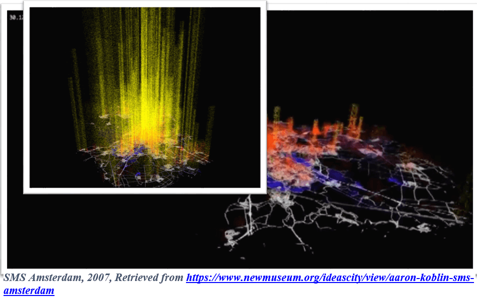
There is another project in the same point, it’s about visualizing SMS messages being sent in the city of Amsterdam. The picture show us the daily ebb and flow of people sending SMS messages from different parts of the city.
Data visualization is going to change the way we work with data. We will be able to respond to issues more rapidly. The way we view data will be different. Data visualization will promote creative data exploration.
Visualizing Big Data
Data Visualization is how we make Data (programming), Visualization (design) to join into a narrative story. If you want to be focused on the visualization part, big data will always need programming, even though maybe there’s some advance tools out there that encapsulate deeper levels. If you come from a designer, you may want to practice your skills in Illustrator first and try to connect things. Programmer should learn how design language works and its principles. So whether you comes from programmer or designer, it’s a fair side for everyone.
What is the similarity between a data visualization and an infographic?
Both infographics and Data Visualization are tools used to visually represent data. They make it easier for the web users to grasp difficult concepts by communicating wider context in a summarized visual form.
Infographics are created to tell and explain a specific story for a specific audience. They are subjective, because information is presented and sensitivity designed with context in a way that will be accessible for a specific audience. The graphic design use illustrations, iconography and different graphical flairs to illuminate the content. Each illustration should be presented in a different way.
Therefore, data visualization is an objective discipline. It could make a sense of the data, or change a data set into a more accessible form. This data sets could be massive, so the data visualization can be generated automatically through the use of algorithms or computer programs. And the same process could be applied to many data set.
When Should You Use Infographics or Data Visualization?
There are many applications for both data visualizations and infographics.
Data Visualization
- Newsletters: They are shorter than a blog post, but longer than a social media post, newsletters are perfect for data visualization. Data visualization can be included in an email newsletter to feature statistics or status.
- White Papers & eBooks: Include data visualization to help prove the points in the document to influence readers.
- Annual Reports: while collecting the year’s greatest hits for an internal team, or wanting to share data with clients, creating an illustrated annual report, complete with data visualization can provide an overview of the past year, success stories, and analysis.
Infographics
- Blog Posts: Because blog posts are written for a specific purpose.
- Case Studies: Paired with a study of a particular context, an infographic can provide engaging visuals and succinctly summarize a lengthy report, offering valuable insights to readers.
- Marketing Content: To build greater awareness of a brand, consider distributing an infographic across a channels, by separating it into short sections to increase social sharing.
What are the different usages of data visualization?
There can be six ways of defining data with the help of charts, and each quantitative correlation of data responds to a unique message.
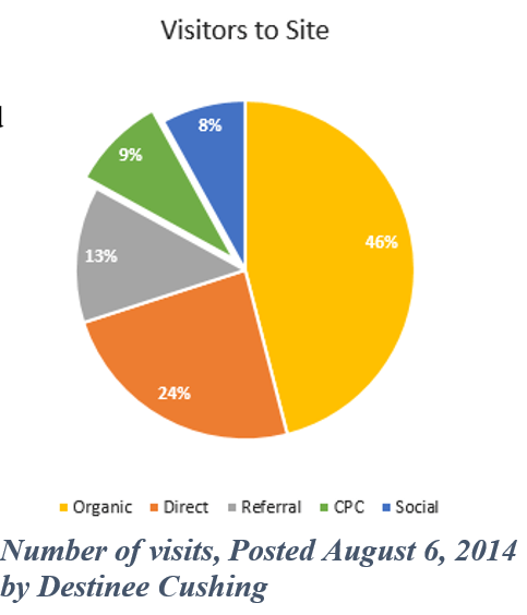
Understanding ratio: To comprehend the ratio of a segment with respect to its totality, pie charts are used to display market shares of the variables that adds up to 100%. The chart uses angles to show the relative size of each value.
There is another type of pie charts with a hole in the middle: donut charts use the length of an arc to indicate the size of the value. Donut charts are essentially the same as pie charts. They show separately to focus on their values.
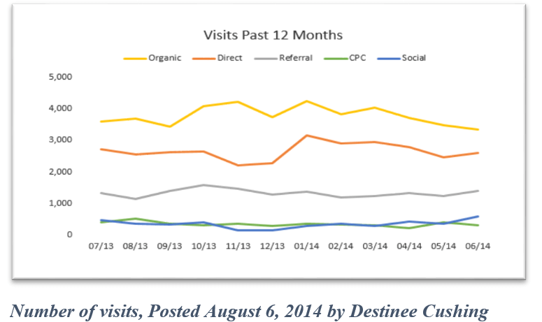
Depicting time-period: With the help of line charts, one can arrange data as they were recorded over a period of time. For instance, if a company wants to find the trend of car sales in Brooklyn, they can refer to a line chart that can demonstrate per year sales.
Digression: Apart from understanding market ratio, a bar chart can also be used to evaluate the validity of data alongside another reference. For example, one can get a pictorial view of “planned versus achieved” with the help of charts.
Frequency division: Typically, a histogram is used to record the number of observations of a variable over a time-period. These graphical forms can be used to analyze ascend or descend of the variable over time to make informed decisions.
Geospatial distribution: using a cartogram, one can compare a variable across the geographic limit to analyze a particular trend that lay over a city, state, or country. For instance, finding out the literacy rate of people by their states in a country.
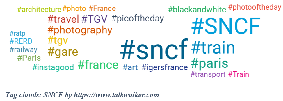
Introduction to Word Clouds / Tag Clouds
Similar to a histogram, word clouds represent the frequency of certain words, terms or expressions. They show the frequency of terms used in a paragraph, RSS feed, or other block of text by scaling the size of the terms and color to highlight the frequency of occurrence.
Word clouds are not easy to create in Excel; however, many generators, like Talkwalker, exist to create colorful and informative word clouds.
Par Sara Lgana, 2017-2018 year group of M2 IESCI at the University of Angers
References
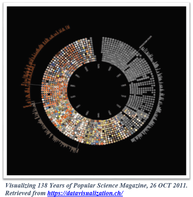
- WIEDERKEHR, B. (2011, 10). Visualizing 138 Years of popular Science Magazine. DATAVISUALIZATION.CH. Retrieved (03/01/2018) from https://datavisualization.ch/showcases/visualizing-138-years-of-popular-science-magazine/
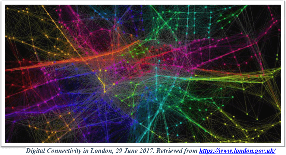
- (2017, 07). Digital Connectivity in London. Mayor of London. Retrieved (03/01/2018) From :https://www.london.gov.uk/about-us/london-assembly/london-assembly-publications/digital-connectivity-london
- History of cartography. Retrieved (03/01/2018) from : http://en.wikipedia.org/wiki/History_of_cartography#Early_Greek_literature
- Hurricane Sandy: Every hurricane visualised since 1851 – Simon Rogers (2012) 29 October. Retrieved (03/01/2018) from:http://www.theguardian.com/news/datablog/2012/oct/29/every-hurricane-visualised-since-1851
- How to Make Your Data Pretty? Utilize These Data Visualization Tools – Omkar Mishra (2015) 16 February. Retrieved (10/01/2018) From : http://www.business2community.com/digital-marketing/make-data-pretty-utilize-data-visualization-tools-01156669
- What’s the difference between an Infographic and a Data Visualisation? Retrieved (10/01/2018) From http://www.jackhagley.com/What-s-the-difference-between-an-Infographic-and-a-Data-Visualisation
- Prttchard, Matthew. (2016, 12). Data visualization vs. Infographics. Retrieved ( 15/01/2018) From: http://killerinfographics.com/blog/data-visualization-versus-infographics.html
- Fundamentals of data visualization, (2016) Retrieved (15/01/2018) From:http://napitupulu-jon.appspot.com/posts/fundamentals-data-visualization-ud507.html
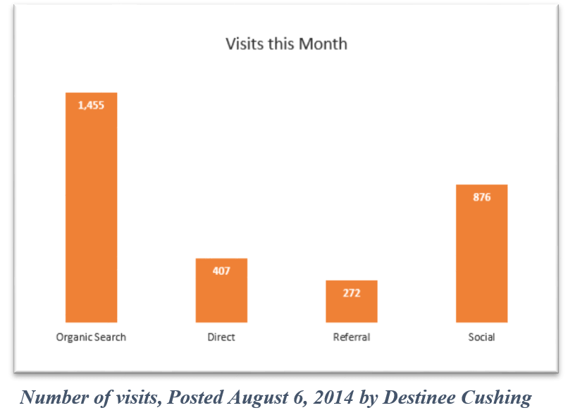
- Destinee, Cushing. (2014,8). Data Visualization Guide For Marketers. Retrieved (20/01/2018) From https://authoritylabs.com/blog/data-visualization-guide-marketers/
- https://www.talkwalker.com